Friday, 25 September 2015

Research and Planning- Analyse 2 music magazine covers Part 2


Hip Hop magazine
Here is the second Rap magazine I am going to be analysing and this is also one of the very popular rap magazines out there today. 


The main character shown on the front cover is the world-wide famous rapstar Jay-Z and he is huge in the music industry and has paired up creating songs with world renown artists such as: Alicia Keys, Justin Timberlake and Kanye West. 

The genre of this magazine is clear that it is a rap magazine because the Masthead shows 'Hip-Hop' in large bold writing and Jay-Z is shown wearing chains and a ring, which associate with the steretype of all rappers wearing lots of bling.

The audience the magazine is aimed at is normally stereotyped for instance: skin colour, age, gender and class. Skin colour is the point that this is aimed at the African American community because generally lots of African American people listen to Rap and the higher majority of rappers are Black, the age it is aimed at would be younger ages mainly 15-30 because rap influences younger generations nowadays. Also in terms of gender, Rap is more popular within the Male community (this is possibly because of all the profanity towards women shown in the lyrics used by most/ if not all popular rappers) and also class is another stereotype of audience because Rap is mostly listened to by Middle class/ Lower class people because it is accepted by them but rarely do you see any upper class individual listening to Rap.


Also the image used in the main image is a eye level shot, this is used to grab the readers attention and his eyes tell a story of how he does what he wants and isn't scared of anyone or anything because he is one of the most famous rappers in the world.

Research and Planning- Analyse 2 music magazine covers Part 1

XXL magazine
Here is the first Rap magazine I am going to be analysing and is one of the most well known Rap music magazines in the industry.

The main characters of the magazine cover shown are 50 Cent (Curtis Jackson) and Soulja Boy (DeAndre Cortez Way) and these are two very well known rappers that are not only huge in the rap industry but also in the music industry altogether and having them on the cover will attract many Rap fans into buying the magazine.

The genre of this magazine is clearly Rap because 50 Cent is dressed like a 'thug' and stereotypically Soulja Boy wears his pants low with lots of gold jewellery (bling) these general stereotypes about Rap are what segregates it from other music genres.


In the images they are represented in some ways as gang members/ thugs because 50 cent is covering his face up in a way that suggests he is a thug. However Soulja Boy is the common 'gangster' type, with a body full of tattoo's, low hanging jeans, lots of gold bling on show and a shaved hair style.


The audience the magazine is aimed at is normally stereotyped for instance: skin colour, age, gender and class. Skin colour is the point that this is aimed at the African American community because generally lots of African American people listen to Rap and the higher majority of rappers are Black, the age it is aimed at would be younger ages mainly 15-30 because rap influences younger generations nowadays. Also in terms of gender, Rap is more popular within the Male community (this is possibly because of all the profanity towards women shown in the lyrics used by most/ if not all popular rappers) and also class is another stereotype of audience because Rap is mostly listened to by Middle class/ Lower class people because it is accepted by them but rarely do you see any upper class individual listening to Rap.

Also in terms of the image, the shot type used on the magazine cover is a medium long shot, the shot type used really influences the 'thug' look that is a common look in the Rap industry and emphasises how powerful 50 Cent and Soulja Boy are because of the gold, expensive jewellery on show, the tattoo's and big muscles (50 Cent) and the scary way they stare into the camera. Also the background is white to clearly show Soulja Boy's tattoo's and so Fifty's thug look is visible to the viewer.

In terms of text used, in the logo it really emphasises the name of the magazine using in some ways a pun because the magazine is named 'XXL' and the text shown is extra large and stands out because it is in a large red box that clearly stands out on the front cover. Also at the side of the rappers are large cover lines saying '50 Cent and Soulja Boy' in clear, large, bold text and this emphasises the power and popularity of both rappers because it is the largest piece of text on the front cover and would appeal to most rap genre fans because of the prestigious rappers shown on the front cover. However there are also a small section of cover lines in the top right corner that shows feauturing famous rappers that are included in the magazine but the size of the text shows how the pair in the image on the front cover are much more popular and a higher influence on the 'Rap game' than those less famous rappers shown in small in the corner.

Research and planning- Media shots

Here are 12 media shots we looked at in depth that are common in the media today:


Wednesday, 23 September 2015

Research and Planning- Magazine cover and contents page evaluation


This magazine cover and contents page is a lot better than the first I created, this is because I added lots more features to the magazine which have improved the way the magazine now looks. For instance I have added: an improved barcode, longer more detailed cover lines, a new and more related picture to the magazine cover, a picture on the contents page, the clarendon logo and improved the text colours to suit the magazine.

Magazine cover evaluation
In my opinion the magazine cover is a nice detailed piece of work. It has interesting cover lines to draw in the target audience, the cover line text and masthead fonts stand out clearly and boldly for the reader to see and the layout of the cover looks professional to me. I think what could be improved is the picture, it is too far out and you can't really see the student up close and also the space underneath the picture could do with cover lines or text so it doesn't look so empty. However in contrast to my last magazine cover it has improved massively, unlike the old design, this design has smaller more suitable text and a much better layout in comparison, but also the text in the last magazine cover was too large and didn't fit with the background colour.

Contents page evaluation
In my opinion the contents page is the best of the two. The picture fits perfectly around the text and is suitable for the contents page. And the colours match the Clarendon logo which makes the content page that much better. The cover lines are also very long and detailed and give the reader a clear insight on what they want and where to find it which is always helpful for a magazine. In contrast to the old contents page, it has improved greatly. I feel this is because I have taken more time on the contents page this time and researched college magazines to get a much better idea on how it should look. I think that the implementing of the picture makes the contents page look a lot better and more professional, also it looks a lot more presentable as the colours have been coded and changed in relation to the Clarendon logo whereas on the old contents page it was dull and boring and only the same font.

Research and Planning- Improved Magazine Cover, Includes Contents Page

This is the improved magazine cover and contents page I have created, it is much better than the previous contents page and magazine cover.

Research and Planning- Magazine cover interview

This is my interview for my magazine cover, and was given good feedback on how I am going to improve the magazine cover.

Research and Planning- Magazine Masthead Fonts

 These are my fonts I created to match each magazine genre. I created them on cooltext.com

PopWorld
 I created a pop related theme for this magazine, by using the text 'groovy' fon, it fit well with the pop genre because it's bright and vibrant and It would appeal to both sexes and especially a teenage audience.

 Death metal
I picked a gothic/horror type of font for this genre of music, which is composed of dark colours and red which link closely with gothic colours. I picked this font because it stood out from the rest because it was very creepy and appropriate for this type of magazine.

Popcorn
In this font I wanted to create a film style font to blend in with the magazine to do this I picked the 'heroic bold cartoon' font because I felt it would help the audience to understand the genre of the magazine.


Research and planning- Interview questions

My college magazine questions for interviews

1) What do you think of my magazine front cover?
2) Can it be improved in any way? How would you improve it?
3) Do you think the cover helps you to know whats going on?
4) If you had to buy the magazine, would you consider buying it?
5) From 1-10 how would you rate the magazine?

Research and Planning- My college magazine cover and contens page


This is my first draft of my magazine cover and contents page, I am going to list and ask some questions for my target audience and get there opinions on what they think of my magazine.

Research and planning- Medium close up's


These are a few examples of a medium close up, now I need to put these into my magazine.

Research and planning- College magazine analysis

The large bold masthead used named 'COLLEGE lifestyle' distinctively shows that this magazine is about a college to the audience.

Above the Masthead there is a season and a year, 'Summer 2009' this means that each magazine must be published each season holiday e.g. summer, Autumn and winter.

The main image on the front cover shows a man carrying educational books about law and society, this outlines that the person on the cover is a student and educational and ties into the college style magazine.

The magazine also has a barcode and a price tag underneath it, this shows that the magazine is a professional magazine and also the small cover lines give the viewer an insight to what is inside the magazine and what it is all about.

Research and planning- Film Review


Research and planning- Photoshop Challenge


1) Firstly I opened up an A4 document on photoshop

2) Then I opened a text box to write in, I typed in 'AS media' and changed the colour to red, the size to 30 and the font to 'Matura MT script capitals regular'.

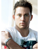
3) I then found a close up image on google of Channing Tatum and placed the image underneath my text.

4) I then used the colour replacement tool to blend his hair into a golden blonde colour (using the colour yellow).

5) I then used the brush tool to create the red border around the image.

6) To finish it off I changed the background colour to blue to make the image and the text stand out more.

Research and planning- Skin tutorial

Before
How I improved her look
1) Firstly I opened up Adobe Photoshop and opened up the image that needed touching up.
2) I then firstly started to cover up her spots using the spot healing brush tool.
3) I then duplicated a layer and added a smart blur filter and reduced the opacity to 45% to give her skin a nice and smooth look
4) Then I added the Lip gloss look by zooming in 200% and using a pink brush tool and replacing the old colour with a more refined glossy pink colour.
5) I then zoomed in to the eyes and replaced the dull black coloured eyeliner to a brighter blue colour by painting over it with the dark
After
blue brush at a small size very precisely.
6) Then it was the hair and I coloured this by using the eyedropper tool, I selected the darkest part of her hair and copied this colour to the paint tool and changed the rest of her hair to a fair brown colour.
7) To finish off her look I used the brush tool to colour a section of her cheeks in a pink/red colour and to make this look natural I reduced the opacity to 45% to give her cheeks a nice natural contouring look.

Research and planning- Movie Poster

Before 
Here is a poster from one of the X-MEN franchises, using this picture and a close up shot of Channing Tatum I'm going to put Channing Tatum's face over Wolverines (Hugh Jackman).

1) Firstly I put cut out Channing Tatums face by using the lasso tool very precisely around his face (but still leaving white areas around the face), to remove the white background areas still attached to his face I then used the magic wand tool and removed all the white areas to just have his face.

2) I then changed the opacity of Channing Tatum's head and erased the hair area so only Wolverine's was visible and also around the face so the face fitted perfectly.

3) I then used the eyedropper tool to alter Channing Tatum's skin colour to fit Hugh Jackman's. And to make this look more realistic I changed the opacity of the eraser to around 6% and blended the skin to fit Wolverine's.
                                                             
4) Then to add the bearded Wolverine to Channing's face  I erased (13% opacity) the area around the beard and also used the eyedropper/brush to make the beard look more defined and realistic.

Finished Movie poster Edit
5) To finish off and make the photoshopped image look as realistic as possible, I lastly changed the Contrast and Brightness of the background and Channing Tatum's face so that the body of Hugh Jackman matched a similar skin tone to the face of Channing Tatum.

After
Channing Tatum is now the new member of the X-MEN, taking over Hugh Jackman as wolverine.

Research and planning- Photoshop tutorial