Below starting from September 2015 you will find my Research and Planning posts. But after this you will find my evaluation posts (questions 1-7) and my completed music magazine products. I have attempted to make my layout clear and easily accessible so that it is easy for you to read and look over.
Enjoy, Many thanks, Lewis
Wednesday, 27 April 2016
Evaluation- Question 6- What have you learnt about technologies from the process of constructing this product?
This is an example of me using photoshop in this example I edit the image of Bradley Cooper by removing the white background behind him so I am able to put the picture anyhwhere I like without a background.
This is another example of me using photoshop here I edit the model image by changing his eye colours.
This is another example of me using photoshop in this example I edit the model by giving his face a lift and imporving his features.
This is an example of me using blogger and uploading something to my blog.
This is an example of me using indesign to try and make a magazine, as you can see I am not very good at this software compared to photoshop.
Wednesday, 20 April 2016
Evaluation- Question 4- Who would be the audience for your media product? And why?
Below I have placed a drawing of a figure I would deem to be parf of my target audience which is very stereotypical and the text around it explains why they are the specific target audience and who they are.
Evaluation: Question 2- How does your media product represent particular social groups?
Below is a gif I created to show how my music magazine represents a particular social group
Similarities of images:
The similarities of the images are: The facial expressions displayed are very similar, both aiming to intimidate and show power by using a powerful stare, similar lighting used in the background to make both artists clearly stand out and visible, both are wearing flashy jewellery, hand placement and posture is also very similar (leaning a certain way with hands placed near the lower part of the body which emphasises that they don't care.
Differences of the images: Clothing is different in both images (one is wearing a loose top with chains around his neck and the other is wearing a red jacket looking like a JD model in some elements), the shot type is very different the image of Jay is more of a long shot which shows all of his body but the image of my artist displays half his posture, the posture is also slightly different as Jay leans back but my model leans forward and also lastly the hair; my model has lots of hair whereas Jay-z goes for the 'no hair no care look'.
Wednesday, 6 April 2016
Research and Plannning- Complete magazine front cover
Tuesday, 5 April 2016
Research and Planning- Finished Double page spread
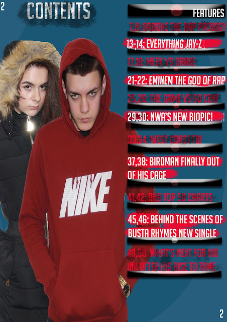
Research and Planning- Progress post contents page finalised
Similarities:
- page numbers
- layout of cover lines and text
- title layout
- colour scheme
- some stories inspired from the magazine contents page
Thursday, 10 March 2016
Thursday, 25 February 2016
Research and Planning- Second Drafted contents page
- 50 pages is clearly not enough for a magazine
- The pages are more spaced out i.e. 50,54,60,64 rather than 3,4,5,6,
- The background could do with a change to white instead of the blue colour
- There is not enough text in comparison to the professional made magazine
- The layout is scruffy on the draft compared to the neat layout of the other magazine
- The images look like they have been squeezed together just for the purpose of getting two images in and would look better with only one featuring on the contents page
- Lacks detail in text and only has artists names
- Draft is out of proportion looks like no guides were used to make it neater
- Needs to consider audience feedbaxk
Friday, 29 January 2016
Research and Planning- First draft Double page spread
Friday, 22 January 2016
Research and planning- First draft of Contents page for music magazine
Thursday, 14 January 2016
Research and Planning- What inspired my front cover
Subscribe to:
Comments (Atom)


