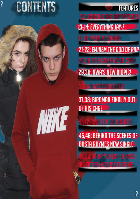
- 50 pages is clearly not enough for a magazine
- The pages are more spaced out i.e. 50,54,60,64 rather than 3,4,5,6,
- The background could do with a change to white instead of the blue colour
- There is not enough text in comparison to the professional made magazine
- The layout is scruffy on the draft compared to the neat layout of the other magazine
- The images look like they have been squeezed together just for the purpose of getting two images in and would look better with only one featuring on the contents page
- Lacks detail in text and only has artists names
- Draft is out of proportion looks like no guides were used to make it neater
- Needs to consider audience feedbaxk


No comments:
Post a Comment